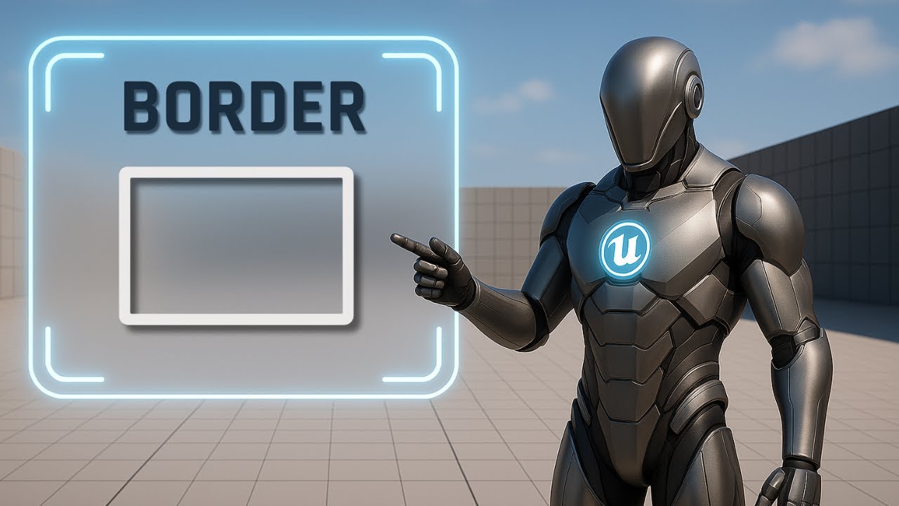
Border – Wrap and Style UI Blocks
Learn how to use the Border widget in Unreal Engine to wrap, style, and organize panels with color, padding, and overlays for cleaner UI.
This is Rambod, and in this tutorial we’ll explore the Border widget in Unreal Engine’s UMG system.
The Border is one of the most useful UI containers — it lets you wrap a widget, apply padding, and add a styled background or outline. By combining it with Overlay, you can stack multiple elements inside and create professional-looking UI blocks.
By the end of this guide you’ll know how to:
✅ Add and configure a Border widget
✅ Customize color, brush, and padding
✅ Use an Overlay to stack content
✅ Center text and images with alignment settings
✅ Apply Border for modular, styled panels in your UI
1) Adding the Border Widget
- Create a Widget Blueprint with a Canvas Panel as root.
- Drag in a Border widget and drop it into the canvas.
Slot settings (Canvas Panel Slot):
- Anchor → Center
- Position X = 0, Y = 0
- Size X = 200, Y = 100
- Alignment X = 0.5, Y = 0.5
👉 The Border is now centered on the screen and sized large enough to be visible.
2) Styling the Border
- Select the Border and go to Appearance:
- Brush Color → choose any color (e.g., dark gray for panels, bright tones for highlights).
- Brush Image → you can set a texture or image if you want a patterned border.
💡 For this tutorial, we’ll stick to a solid color to clearly show the effect.
3) Adding an Overlay Inside the Border
The Border only holds one child, but you can stack multiple elements by using an Overlay inside it.
- Drag an Overlay into the Border.
- In the Details → Slot (Border Slot), set Padding = 10.
👉 Padding prevents content from sticking directly to the edges, giving breathing room for cleaner layouts.
4) Adding Content to the Overlay
Inside the Overlay, add:
- Image Widget → acts as the background.
- Text Block → acts as the label or title.
Image settings:
- Color → choose a contrasting tone so it stands out against the Border.
- Slot (Overlay Slot) → set Horizontal = Fill, Vertical = Fill.
👉 This makes the image expand to cover the whole Overlay space.
Text Block settings:
- Change text to any label (e.g.,
"Title"). - Color = White (or other contrasting shade).
- Font = Droid Sans Mono (or another clear typeface).
- Increase Font Size for readability.
- Horizontal Alignment = Center, Vertical Alignment = Center → ensures the text sits perfectly in the middle.
Result: a styled card with a colored border, background image, and centered text label.
5) Practical Use Cases
The Border widget is versatile and can be used for:
- Buttons → wrap text/images with consistent padding.
- Panels → highlight sections of a menu or HUD.
- Tooltips → give clarity to floating info boxes.
- Status indicators → e.g., health bar background or warning label.
- UI cards → inventory slots, achievement panels, or profile boxes.
💡 Borders help create visual hierarchy — they guide the player’s eye and make your UI more readable.
Subtitle Expansion (Full Tutorial Flow)
“Start with a Canvas Panel root. Add a Border widget, anchor it center, set position X=0, Y=0, alignment 0.5×0.5, and size 200×100. With Border selected, adjust Brush Color in Appearance. Borders can also use textures, but here we’ll stick to solid color. Inside the Border, add an Overlay. Set its Padding to 10 to give breathing room. Add an Image inside the Overlay, set it to Fill horizontally and vertically, and choose a contrasting color. Add a Text Block on top, change text, set font to Droid Sans Mono, color white, increase size, and align center. Now you have a styled UI block with a border, background image, and text overlay. Borders are perfect for panels, tooltips, buttons, and modular UI sections.”
Wrap-Up
The Border widget is simple but powerful:
- Wraps and styles any widget
- Provides padding and background color/image
- Works great with Overlay for stacked content
- Ideal for panels, buttons, tooltips, and UI cards
👉 Watch the full tutorial: YouTube Link
👉 More UI guides at rambod.net
👉 Subscribe to Rambod Dev to follow the full Widget Blueprint Series.