Easy Grid Panel Tricks for Unreal Engine Beginners!
Learn Grid Panel basics in Unreal Engine. Rows, columns, spans, layering, and alignment explained for clean, responsive UI layouts.
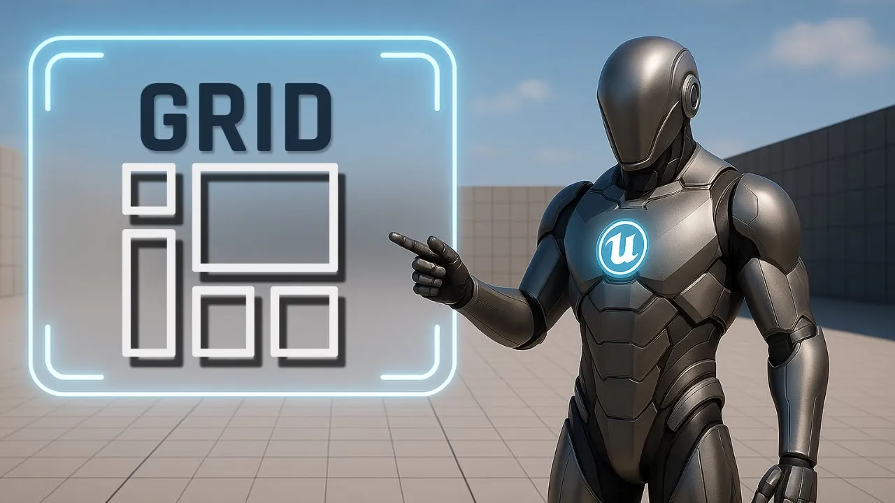
This is Rambod, and in this tutorial we’re diving into the Grid Panel in Unreal Engine’s UMG system.
Grid Panels are perfect for building structured UI with rows and columns — ideal for inventory systems, stats dashboards, and modular menus.
By the end, you’ll know how to:
✅ Assign widgets to rows and columns
✅ Resize widgets and auto-adjust cells
✅ Use Row Span & Column Span for flexible layouts
✅ Control layering with slot settings
✅ Fine-tune alignment and nudging for pixel-perfect UI
1) Setting Up the Grid Panel
- Create a new Widget Blueprint.
- Add a Canvas Panel as root (default).
- Drag a Grid Panel into the Canvas.
Slot (Canvas Panel Slot) configuration:
- Anchor → Center
- Position X = 0, Y = 0
- Size X = 450, Y = 200
- Alignment X = 0.5, Y = 0.5
👉 Now the Grid Panel is perfectly centered.
2) Adding and Coloring Image Widgets
Let’s populate cells with colored images for clarity:
-
Drag an Image widget into the Grid Panel.
- Appearance → Color = Red
- Slot (Grid Slot): Row = 0, Col = 0
-
Add a second Image.
- Color = Yellow
- Row = 0, Col = 1
-
Add a third Image.
- Color = Blue
- Row = 1, Col = 1
-
Add a fourth Image.
- Color = Light Cyan
- Row = 2, Col = 1
-
Add a fifth Image.
- Color = Dark Green
- Row = 2, Col = 0
-
Add a sixth Image.
- Color = Orange
- Row = 1, Col = 0
At this point, you should see a rainbow-like layout across the grid.
3) How Grid Auto-Sizing Works
- Select the Blue image (Row 1, Col 1).
- Set Image Size = 60×60.
- Notice: the row and column stretch to fit the largest widget in that row/column.
Do the same for the Light Cyan image in Row 2, Col 1 (set to 60×60).
👉 Grid Panels adapt automatically.
4) Layering and Overlapping
- Add a seventh Image (Color = Green).
- Slot (Grid Slot): Row = 2, Col = 1 (overlaps Light Cyan).
- Change Layer = -1 → sends it behind the cyan block.
💡 Grid layers work like Z-order:
- Higher numbers = in front
- Lower numbers = behind
5) Row Span & Column Span
-
Select the Orange image (Row 1, Col 0).
- Row Span = 2 → stretches across Row 1 + Row 2.
-
Select the Red image (Row 0, Col 0).
- Column Span = 2 → covers two columns.
-
To demonstrate stacking:
- Set Yellow image Layer = 1 → brings it in front of Red.
👉 This shows how spanning + layering combine for flexible layouts.
6) Nudge & Fine-Tuning
Each widget can be nudged for pixel-perfect positioning.
- Select the Blue image (Row 1, Col 1).
- Slot (Grid Slot):
- Nudge X = 4
- Nudge Y = -4
This shifts it slightly inside its cell for manual adjustments.
7) Adding Text Blocks
Let’s add labels to make the grid more functional:
-
Drag a Text Block.
- Row = 1, Col = 2 (rightmost cell on Row 1).
- Appearance → Increase Font Size for readability.
-
Add another Text Block.
- Row = 2, Col = 1 (same as Cyan/Green).
- Layer = 2 so it renders on top of the image.
- Change color to Black for contrast.
💡 Text layering allows combining UI elements with background blocks.
8) Grid Behavior Recap
- Cells auto-size based on the largest widget per row/col.
- Row/Column Span lets one widget stretch across multiple cells.
- Layer controls stacking order (higher = in front).
- Hierarchy order resolves ties if layers are equal.
- Nudge enables subtle pixel adjustments.
- Arrow buttons in Details panel let you reorder rows/columns quickly.
👉 This makes the Grid Panel a powerful tool for clean, responsive layouts.
Subtitle Expansion (Full Tutorial Flow)
“Start with a Canvas Panel, add a Grid Panel, center it with anchor middle, size 450×200. Add six Image widgets: Red (Row 0, Col 0), Yellow (0,1), Blue (1,1), Light Cyan (2,1), Dark Green (2,0), Orange (1,0). Resize Blue and Cyan to 60×60 to see auto-stretch. Add a Green Image on top (Row 2, Col 1), set Layer = -1 to push it behind. Apply Row Span 2 to Orange, Column Span 2 to Red. Raise Yellow to Layer 1 so it appears above Red. Use Nudge to adjust Blue (X=4, Y=-4). Add Text Blocks: one in Row 1, Col 2 with larger font, one in Row 2, Col 1 layered above Cyan with black text. Grid auto-sizes, layers stack, spans stretch, and nudging fine-tunes. Perfect for inventories, dashboards, and modular UIs.”
Wrap-Up
The Grid Panel is one of Unreal Engine’s most powerful UI containers. It provides:
- Structured rows & columns
- Auto-sizing for clean alignment
- Row/Column spanning for flexibility
- Layering and nudging for polish
💡 Use it for inventories, HUDs, dashboards, or stat panels where clean structure is essential.
👉 Watch the full tutorial here: YouTube Link
👉 More UI guides at rambod.net
👉 Subscribe to Rambod Dev for the full Widget Blueprint Series.