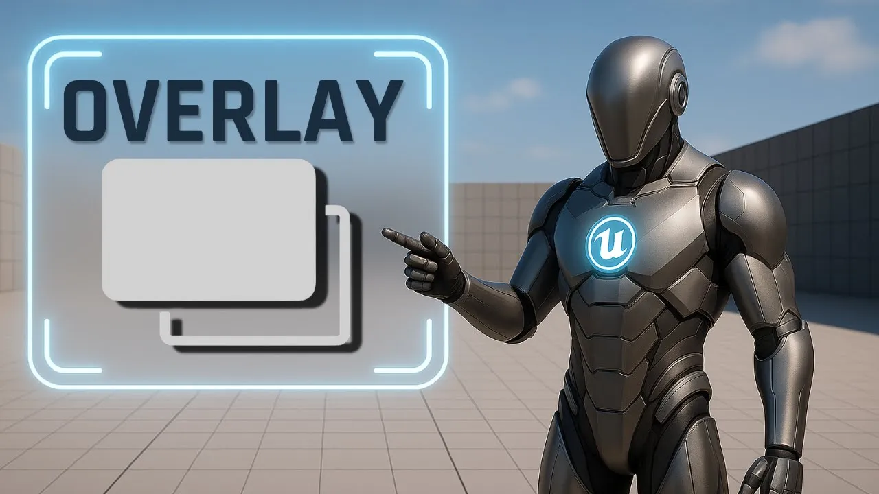
Overlay in Unreal Engine UI – Build Layered Widget Cards
Learn how to design layered, responsive UI cards with Unreal Engine’s Overlay panel. Master anchors, alignment, padding, and stacking order for clean layouts.
This is Rambod, and in this tutorial we’re breaking down the Overlay widget in Unreal Engine’s UMG system.
Overlay is one of the most flexible layout containers because it allows you to stack widgets on top of each other like a layered card system. This makes it perfect for HUDs, menus, popups, and modular UI components.
By the end of this guide, you’ll know how to:
✅ Center an Overlay in the viewport
✅ Add background and card layers using images
✅ Apply padding for layered styling
✅ Place text in the middle and bottom of the card
✅ Understand how stacking order works in Overlay
1) Adding the Overlay to a Canvas Panel
- Create a new Widget Blueprint.
- Drag a Canvas Panel as the root (default).
- From the Palette, drag in an Overlay widget and drop it inside the Canvas.
Configure Overlay position:
- In the Details panel → Slot (Canvas Panel Slot):
- Anchor → set to Center (middle box in the grid).
- Position X = 0, Y = 0
- Size X = 450, Y = 250
- Alignment X = 0.5, Y = 0.5
👉 Now the Overlay is perfectly centered in the screen with a fixed size card space.
2) Adding Background and Card Images
Background Image
- Inside the Overlay, drag an Image widget.
- Under Slot (Overlay Slot):
- Set Horizontal Alignment = Fill
- Set Vertical Alignment = Fill
This makes the image stretch across the entire Overlay. Keep its color white — it will act as the background.
Card Image
- Add a second Image widget on top of the first one.
- Set alignment to Fill both horizontally and vertically.
- Apply Padding = 10 units.
👉 This creates an inset rectangle effect, great for card-style panels.
- Change its Brush Color to red (or any color you like).
- Reduce Opacity slightly for a transparent, stylish look.
At this stage, you have a layered card background: one solid base, one colored inner panel.
3) Adding Text Layers
Centered Text
- Drag in a Text Block.
- Under Overlay Slot Settings:
- Horizontal Alignment = Center
- Vertical Alignment = Center
This positions the text right in the middle of the card.
Bottom-Aligned Text
- Add a second Text Block.
- Under Overlay Slot Settings:
- Horizontal Alignment = Center
- Vertical Alignment = Bottom
Now you have two text elements:
- One perfectly centered
- One pinned to the bottom edge of the card
💡 You can change the alignment of any Overlay child individually, giving full control for flexible layouts.
4) Understanding Stacking Order in Overlay
Here’s a critical detail:
- Overlay does not use Z-Order numbers like Canvas Panel.
- Instead, stacking is controlled by the widget hierarchy list.
👉 The top item in the hierarchy is drawn first (behind others).
👉 Items below it are layered on top.
For example:
- If the background image is listed first, it will sit behind.
- The card image should be listed below it, so it appears in front.
- Text blocks listed after images will render on top.
This means you manage the visual order simply by reordering the hierarchy in the Designer.
5) Recap of Key Concepts
- Overlay Panel → lets you stack multiple widgets in the same space.
- Background Image → full size, white base layer.
- Card Image → inset with padding, styled with color + opacity.
- Text Layers → individually aligned to center or bottom.
- Stacking Order → controlled by hierarchy, not Z-Order values.
💡 Overlay is lightweight and powerful — great for building HUD cards, popups, tooltips, or layered menu elements.
Subtitle Expansion (Full Tutorial Flow)
“Start with a Canvas Panel, drag in an Overlay, center it on screen with anchor middle, position 0,0, size 450×250, alignment 0.5×0.5. Add a background Image set to Fill. Add a second Image, also Fill, with 10 padding, set color to red with transparency. Add first Text Block aligned center-center. Add second Text Block aligned center-bottom. Note that Overlay stacking is based on hierarchy order: first item is drawn behind, later items appear in front. This makes it simple to layer cards and UI elements without Z-Order numbers. Overlay is clean, flexible, and ideal for HUDs, menus, or popups.”
Wrap-Up
The Overlay widget is a core tool in UMG for layered UI design. With it, you can quickly:
- Stack images and text for stylish cards
- Control positioning with alignment + padding
- Manage hierarchy for visual stacking
👉 Watch the full tutorial here: YouTube Link
👉 More UI guides at rambod.net
👉 Subscribe to Rambod Dev for the complete Widget Blueprint Series.